LIVING ROOM LOVE
After the kitchen, the next most important room in our home was the living room. We moved into this house with hunter green carpets, burgundy and pink floral accents, a lot of dark wood and contractor color walls everywhere. Funny enough, my home growing up had all of these same elements. Apparently this was the look 25 years ago..
I was actually really worried when we were buying this house about this room in particular. It felt very dark and a little bit awkward in that it's very long and narrow. I hated that the fireplace wall had no windows. There are so many walkways coming in and out I didn't want to block with furniture and I couldn't envision the TV anywhere but center (even though above the fireplace is not my favorite) but sometimes functionally has to win over aesthetics.
GOODBYE GREEN
We started by ripping up carpet, trim and painting the fireplace and walls.
I decided to lighten up the brick with paint, but if I could do it again I would smear it and leave a little showing. We also spray painted the brass on our insert a matte black to polish it off and make it look a little more modern without a big expense.
Fireplace Paint: Benjamin Moore Super White
Wall Color: Benjamin Moore Classic Grey
FLOORS & BUILT INS
This is my sad attempt at trying to give us an ounce of normalcy mid renovation. We were still trying to figure out what size furniture we needed to buy and how we were going to work the space.
The fireplace wall was a hard one for me. I hated how long and dark it felt and desperately craved some windows and natural light, but this just wasn't in our budget. I knew it needed to be the focal point and my go to design feature tends to be shelving.
In our last home Bobby built our entertainment center from scratch, but we wanted a quicker and easier solution this time around and decided to give an IKEA Hack a try with Billy Bookcases. We searched Pinterest for tons of tutorials from people who had already done this and just modified a combination of plans to best fit our space.
This was definitely a quicker and easier route than building the shelves entirely. It was cost effective and took us a weekend to complete. Every now and then I miss the look of my thick custom shelving but overall I'm happy with the turnout and would do this hack again in another space or home.
FURNITURE
This was the day we picked up our new couches. We decided to go with the Stocksund Collection from Ikea. The slipcovers we initially bought are the light beige color.
It's getting better at this point, but it still felt SO bland / empty. There was so much white and it desperately needed some depth and contrast.
DEPTH + DECOR
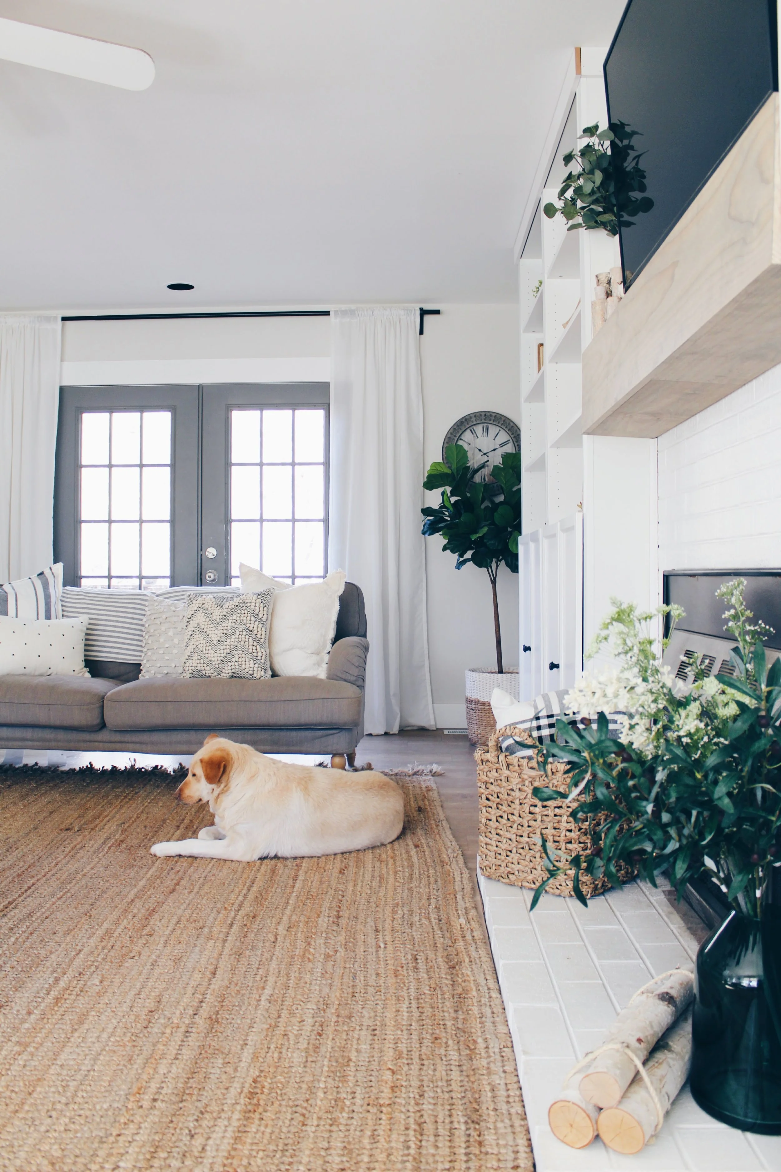
door color: Benjamin moore Chelsea grey, rug: rugsusa.com, curtains: ikea, vivan.
We decided to paint the French doors grey and it literally changed EVERYTHING. I was so scared it was going to make the room feel smaller and it had a completely opposite affect, adding so much dimension and warmth. Another game changer was adding our Jute rug; our living room instantly felt cozy and I love what the texture adds to the space.
I also painted this previously white entry table we built in Benjamin Moore Kendall Charcoal after feeling inspired from the doors. The gray, cognac and white combination is one of the favorites in our home.
TEXTURE & GREENERY:
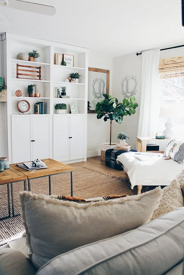
Bringing in a lot of warm woods, matte blacks, differing textures and plants make a world of difference in a room. I picked up my fig trees on sale at Hobby Lobby (yes, they're fake. I kill ALL living plants.)
Pillows of varying size, materials, dimensions, fringes and layering blankets help add interest.
I also strive for much simpler shelving décor now. I pick up pieces from Hobby Lobby, Anthropologie, World Market, Marshalls, Target and At Home for the most part, and of course a good antique shop here and there. I'm planning on doing another blog post on the process of how I situate them, but the simplest way I can explain it is rotation of color, varying heights, textures and balance. (more to come on that)..
I picked up these tables on sale at Hobby Lobby as well (they're actually 2 separate) and decided to join them and make a coffee table. We also added Bamboo blinds to help break up all the white around the windows.
The best part about IKEA furniture is SLIPCOVERS. As you can see, this is one of Boone's favorite spots in the living room. They easily come off and go in the wash and they're as good as new. It also makes it a breeze to buy a different color and swap them out when you're feeling in need of a change!
The two light beige slipcovers are actually discontinued ones I found on eBay. I haven't been able to find the larger couch size, but the differing pieces don't bother me and I think the grey couch looks good framed with the doors.
It's probably obvious but throw pillows and blankets are my favorite. Coziness and comfort are something I really strive for in decorating, I don't see the use of a beautiful living room if you're not relaxed in it. I also have a thing for candles and usually have several burning at all times in most rooms.
I keep the Gaines and McGee families on the coffee table for constant motivation and inspiration.
I love filling our living room with baskets holding extra blankets and pillows. This large one is from World Market, my smaller on the fireplace is from Hobby Lobby. They make for great accent pieces while also prompting guests to get comfortable.
Bobby pretty much let's me do whatever I want to our house design wise, but the one thing he is pretty vocal on are ceiling fans. They are not my favorite, but they work.


