NURSERY

One of the funnest projects to date: designing our baby girls nursery.
This one took time friends. I must’ve had eleven different mood boards before I landed on this one. It was so hard to nail down one style I loved. Children’s rooms have a certain freedom for fun and color that other rooms don’t always allow; however I strongly believe just because the room is for a baby or child doesn’t mean it has to be overly “kiddy”. Nursery’s should be an extension of the rest of your home but in a playful way. Also trying to guess what her personality will be, her name and would this style fit those things? It was a challenge but the best kind.
Disclosure: Some of the links in this post are affiliate links and if you go through them to make a purchase I will earn a commission at no additional cost to you. Keep in mind that I link these companies and their products only when I genuinely love the quality and use them in my own home, and not because of the commission I receive from your purchases. We appreciate every single effort from our following to support this platform and help us continue to create, inspire and grow,
THE MOOD BOARD
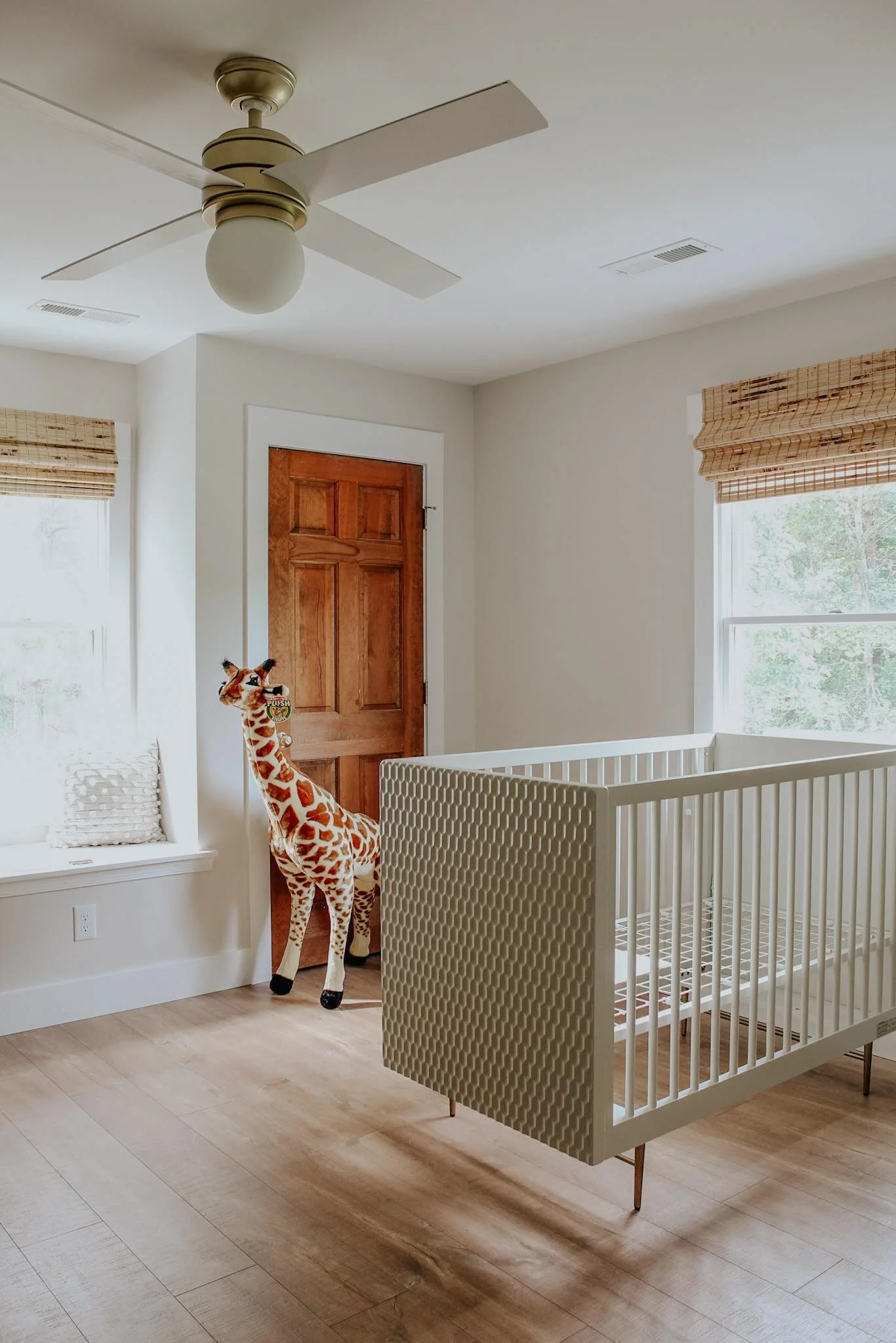
I love brainstorming with mood boards but I rarely follow them to a T. The curtains pictured didn’t end up working and the fabric swatches pictured were inspirational but I ended up going in a different direction. The first things I committed to were the crib, the ceiling fan and the giraffe and everything else just fell into place.
THE PERFECT PAINT COLOR
We sampled three different grey / sage paint colors from Benjamin Moore and ultimately landed on Silver Sage. I had been wanting to try a room where I painted all surfaces the same paint color for a while; trim, walls, doors, ceiling, everything and decided this was the one. I now want to implement this EVERYWHERE because that’s how much I love it. It makes the room feel so much bigger and allows your eye to focus on the overall feel rather than white trim jumping out at you. There’s also a vintage vibe to this room that I can’t quite pin point but I love so much.
TEXTILES:
The next design steps were a combination of new purchases and pulling from existing. The rug is from Anthropologie (linked here). I’m convinced it was made for her room. The pinks and oranges are constantly changing with the time of day and there are subtle pops of sage mixed in that pop with the paint color so incredibly well.
The curtains and mirrors we already had! If you’ve been following for some time, you know that these curtains were previously in our master. I loved them in there, but as her room progressed I struggled to find ones to fit. One day it occurred to me to see what they would look like in here and they looked like they just belonged the entire time. (These were clearance sale from Anthropologie and are unfortunately not available any longer).
The floor pillows I bought last year from World Market (linked here) and same situation; I didn’t know why I was buying them at the time but it was meant to be.
THE BEST ROCKER:
We looked and looked for the perfect rocker and almost purchased one from Pottery Barn for double the price. I’m SO thankful we didn’t. This chair is so ridiculously comfortable. It rocks, automatically reclines and has a phone charging port! We’ve already taken several long naps in it and decided it was worth every penny.
IKEA HACK: DRESSER MAKEOVER
Another item we already had but gave a makeover: our IKEA Hermes Dresser! The dresser that matched our crib was sold out for good so we decided to get creative. I brought home the color swatch book from Benjamin Moore and literally found an exact match. We used their furniture paint and it turned out amazing (it honestly looks better than it ever did before, even brand new). We bought new hardware from Home Depot and Bobby built the changing pad station with 1x2’s that we mounted to the back, that way once she’s older this can still be her dresser without screws in the top.
Our door knobs are from Home Depot and blinds are from Lowe’s; they are the levelor brand in Bamboo color.
All of the prints and candlesticks I stumbled upon while walking through Target one day (of course when I wasn’t shopping for her). The pops of color and whimsical florals fit in perfectly without being matchy matchy.
SHELVING:
Would it be one of our rooms if there wasn’t some DIY shelving involved? Bobby built these and I almost want to make him redo all of our others to match this style. We bought the corbels from Home Depot but he routered the wood edging himself and we painted to match the walls.
CLOSETS
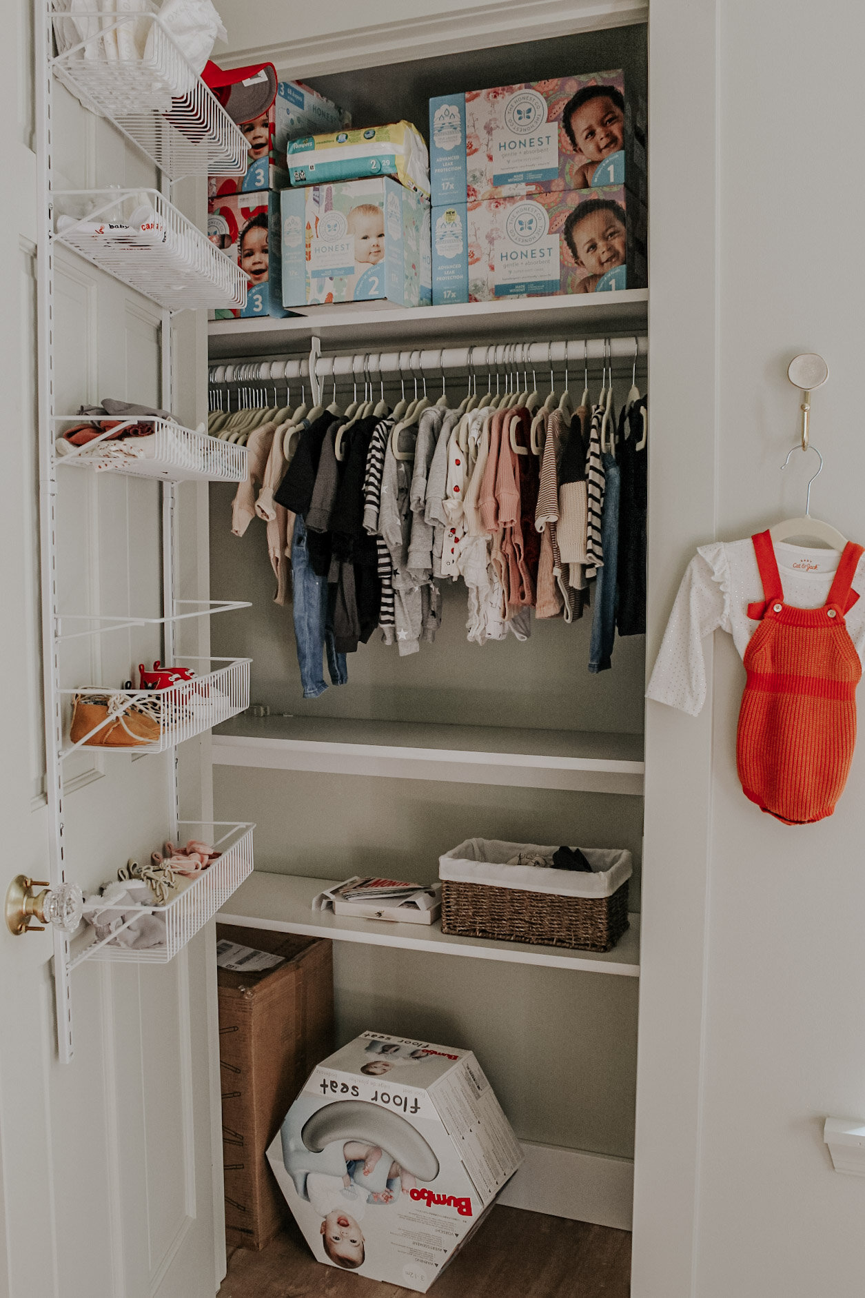
We went ahead and redid her closets to better fit her clothes and add some extra shelves for storage. We almost spent a lot of money on a higher end door storage system and ultimately decided these work just fine for a fraction of the cost. They hold her shoes, socks, hats, headbands, books and manuals we saved from various items perfectly.
REFLECTION:
Nurseries and nursery decor can be a dividing topic among mothers. I know so many people who say they’re the biggest waste of space and money or did one for their first child but would never do one again. This probably won’t come as a surprise to anyone whose been following our page for a while but I strongly disagree. We have spent so much time in this room. It’s a calm landing place for all her belongings and I love sitting in that rocker and staring at this gorgeous space. Bringing home a baby can be chaotic and overwhelming and for me personally, completed beautifully designed rooms brings me calm and peace to the stresses of everyday life.
I also reflect on my own childhood and how much I loved my room. I was always wanting to rearrange, design, paint, buy new bedding, etc. I also vividly remember being very young and loving my own personal space in the house (I guess I’ve been introverted from day one). Of course Viv is just a baby, but as she grows I hope this space brings about the same feelings of safeness, enjoyment and comfort should she need it. Of course she could turn out like her father and just say “whatever you want to do to the room is fine with me!” and that will be okay too.
Disclosure: Some of the links in this post are affiliate links and if you go through them to make a purchase I will earn a commission at no additional cost to you. Keep in mind that I link these companies and their products only when I genuinely love the quality and use them in my own home, and not because of the commission I receive from your purchases. We appreciate every single effort from our following to support this platform and help us continue to create, inspire and grow as a company.
PRODUCT SOURCES + LINKS:
Flooring: Pergo Outlast Laminate in Scottsdale Oak
Curtains: Anthropologie Wakefield Curtain (sold out)
Paint Color: Benjamin Moore Silver Sage in Eggshell
Blinds: Levelor in Bamboo
Door Knobs: Home Depot
Dresser: IKEA Hermes
Giraffe: Target, linked here
Ceiling Fan; Wayfair, linked here
Crib: Pottery Barn, linked here
Rug: Anthropologie, linked here
Curtain Rod: Amazon, linked here
Crib Quilt: Anthropologie, linked here
Rocker: Target, linked here
Bouquet Framed Canvas - linked here
Flower Framed Canvas - linked here
Cat on Chair Canvas - linked here
Swans Framed Canvas - linked here
Large Cat on Chair Canvas - linked here
Floral Oversized Lumbar Pillow - linked here
Floral Oversized Square Pillow - linked here
Candlesticks: linked here
Morrocan Baby Basket: linked here
Closet Door Racks: linked here
Flamingo Stuffed Animal: linked here
Baby Hangers: linked here
Wicker Basket: linked here


